How different would the world look if it was viewed in terms of key information rather than just geography?
That’s exactly what this map sets out to show us by altering each country’s size to reflect a range of key pieces of information.
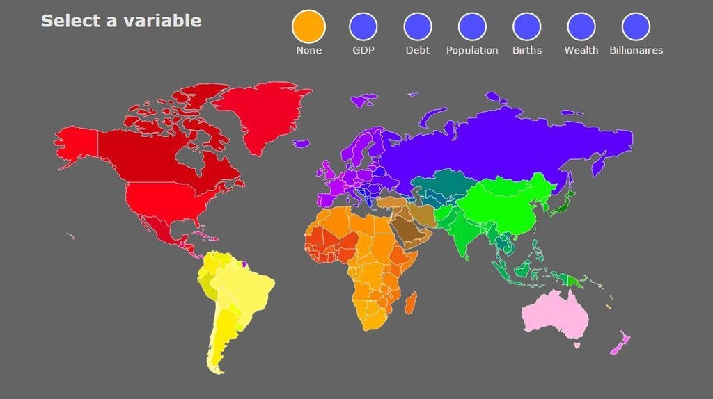
Click on the image above for the full interactive map.
GDP
The GDP-scaled map makes it clear how dominant the US economy is. The next closest country, China, is of only about half the economic size, despite its population being four times as big.
Government debt
If you look at the world scaled by government debt, the most striking thing is how large Japan becomes. The country’s national debt is more than twice its GDP.
The US debt is small by comparison, roughly equal to its GDP.
Population/births
Asia is home to about three-fifths of the world’s population. Together, China and India have more people than Europe, Africa or the Americas.
But when you look at births, Africa grows significantly on the map. According to a report by UNICEF, 40% of the world could be African by the end of the century.
Wealth
Not surprisingly, wealth is not distributed evenly around the regions of the world.
Viewed in terms of wealth, the United States, Europe, China and Japan dominate the map. South American countries, Africa and Russia shrink significantly.
Extreme wealth
Finally, when you see the world in terms of the number of billionaires living in each country, there are again big distortions. The Middle East and Russia become significantly larger, along with all the countries which have a large share of global wealth.
The US has the highest number of billionaires, but relative to population size, it has fewer than either the UK or Germany. India and Taiwan also have significant billionaire populations.
Have you read?
The map that will change how you see the world